For modern businesses, a website is often the first meaningful interaction a customer has with a brand. Whether you operate in homeware, health and wellness, or retail, visitors expect clarity, speed, and ease from the moment they land on your site. Navigation plays a central role in shaping that experience, influencing how users explore content, find products, and ultimately decide whether to trust a business.
Working with a professional web design company ensures navigation is not treated as an afterthought but as a strategic element that supports usability, brand perception, and long-term growth.
This article explains why navigation matters so much and how expert design that benefits both users and businesses.
Understanding Website Navigation and User Behaviour
Website navigation refers to the structure and systems that help users move through a site. Menus, internal links, breadcrumbs, and calls to action all guide visitors from one page to another. When these elements are clear and logical, users feel in control. When they are confusing or cluttered, frustration sets in quickly.
User behaviour studies consistently show that visitors scan rather than read. They rely on predictable layouts and familiar patterns to decide where to click next. Effective navigation reduces cognitive effort, helping users reach their goal without unnecessary thinking. This is particularly important for retail and wellness businesses, where customers often want fast answers, product details, or reassurance before committing.
Navigation design also shapes first impressions. A well-structured menu suggests professionalism and reliability, while a disorganised one can raise doubts about credibility. Over time, this directly affects bounce rates, session duration, and overall engagement.
Navigation as a Foundation for Business Growth
Good navigation is not just about aesthetics — it supports measurable business outcomes. When users can easily locate key information, they are more likely to stay longer, explore deeper, and take meaningful actions such as making a purchase or submitting an enquiry.
For growing brands, scalability is crucial. As product ranges expand or services evolve, navigation must adapt without becoming overwhelming. Poorly planned menus often struggle under growth, leading to cluttered dropdowns and duplicated pages. A strategic approach ensures navigation remains flexible, intuitive, and aligned with business goals.
Businesses seeking a
website designer near me often focus on visuals, but navigation is equally important behind the scenes. Clear pathways support customer journeys, helping visitors move naturally from awareness to decision-making without friction.
How Structure and Hierarchy Improve Clarity
When website menus are planned around how users think and behave, visitors can move through a site with confidence and ease. A clear information hierarchy, shaped by an experienced web design agency, helps users understand where they are and what to do next without hesitation.
- Prioritised page structure
The most important pages are given prominence, while related content is grouped logically. This helps users quickly identify key sections and navigate without unnecessary effort. - User-led navigation planning
Navigation is organised around user intent rather than internal business structure. Designers analyse real user journeys to ensure menus reflect how visitors naturally search for information. - Simplified menu design
Limiting top-level menu items prevents clutter and reduces decision fatigue. Fewer, clearer choices make navigation faster and more intuitive. - Clear and descriptive labels
Menu labels are written in plain, meaningful language so users immediately understand what each section contains. - Consistent placement across devices
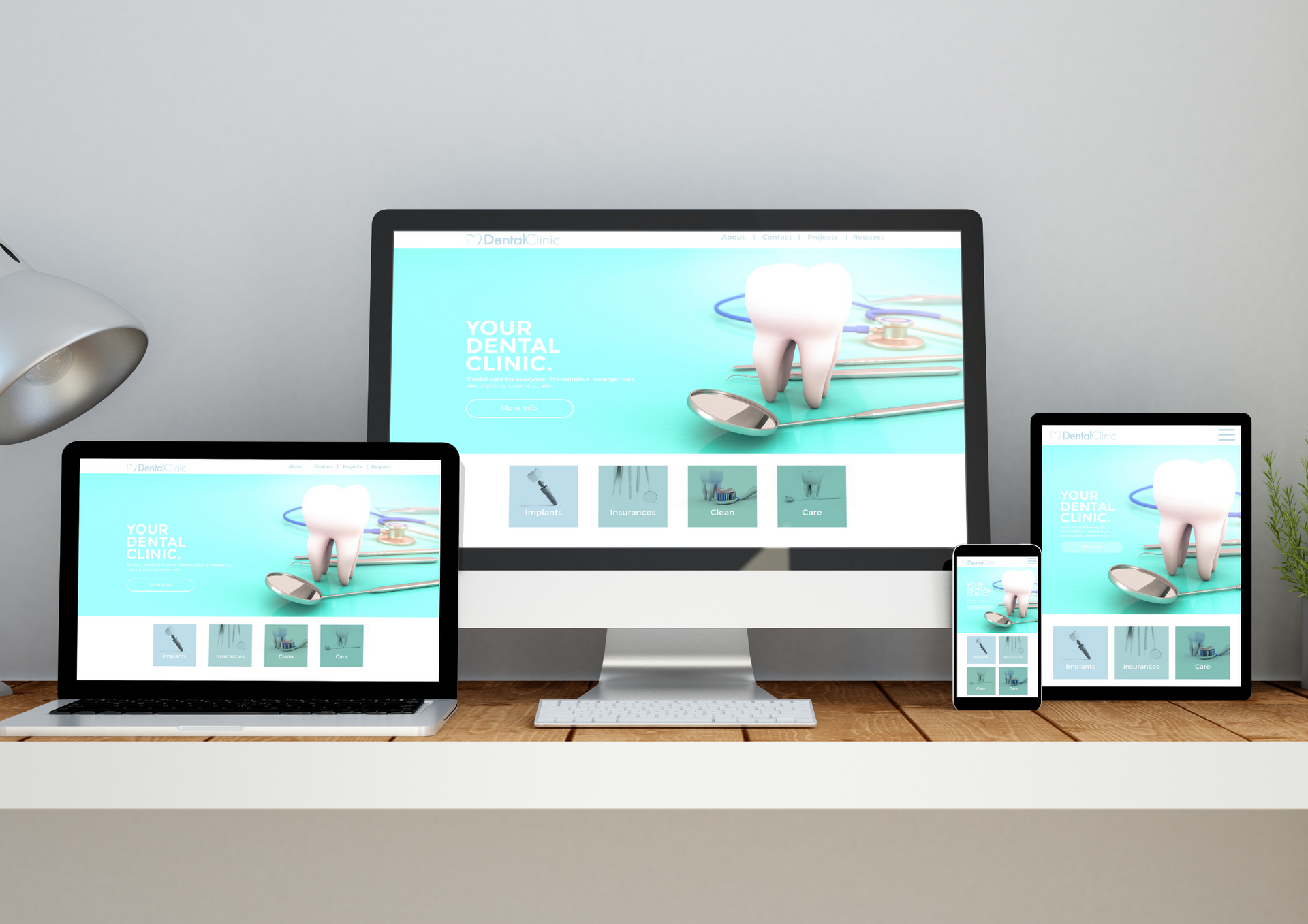
Navigation elements remain in familiar positions on desktop, tablet, and mobile screens. This consistency allows users to scan menus quickly and make confident choices, regardless of device.
The Role of Navigation in Mobile and Responsive Design
With more users browsing on phones and tablets, navigation must adapt seamlessly across all screen sizes to maintain usability and engagement.
- Rising mobile usage
Mobile browsing now represents a significant share of web traffic, particularly for retail and lifestyle businesses. Navigation that works well on desktop can quickly become frustrating on smaller screens if not properly designed. - Simplified mobile navigation
Responsive navigation focuses on clarity and ease of use. Hamburger menus, collapsible sections, and touch-friendly spacing allow users to move through a site comfortably on mobile devices. - Reduced abandonment risk
Poor mobile navigation often leads to users leaving a site early, even when the desktop experience is strong. Clear, responsive menus help keep visitors engaged for longer. - Consistency across all devices
A professional website development company plans navigation for desktop, tablet, and mobile from the outset. This ensures a consistent experience without compromising usability or accessibility on any device.
Navigation, Trust, and Brand Perception
Trust is built through clarity. When users can easily find policies, contact details, product categories, or service information, they feel more confident engaging with a brand. Navigation contributes silently but powerfully to this sense of reassurance.
For health and wellness businesses, clear navigation helps users access sensitive or detailed information without confusion. For homeware and retail brands, it supports browsing and comparison, allowing customers to explore at their own pace.
The best website designers understand that navigation reflects brand values. A calm, organised menu communicates professionalism and care, while an overloaded or inconsistent one can undermine even the strongest visual design.
Navigation is one of the most influential yet underestimated elements of
website design. It shapes how users perceive a brand, how easily they find information, and how confidently they take action. Thoughtful navigation improves usability, supports growth, and strengthens trust across all industries.
Partnering with a knowledgeable web design company ensures navigation is designed with both users and business objectives in mind. Rather than relying on guesswork, professional designers apply structure, research, and experience to create websites that are intuitive, scalable, and effective.
At
ETA Web Design Newport, we focus on building websites that work as well as they look. Navigation is carefully planned to support real user journeys, helping businesses communicate clearly and convert more effectively.
Our approach combines strategic thinking, clean design, and practical development to deliver websites that grow alongside your business. By choosing a web design company that values clarity, usability, and long-term performance, you invest in a digital presence designed to deliver lasting results.
Just out on X: How a
web design company can improve navigation and usability!


